

Tesla rolled out a new user interface this year, and the reception was mixed to quite negative. Although I am not as bothered by most of the changes as others, it actually highlighted a problem that Tesla has had with their user interface that has bugged me for some time: mixing states and actions.
Tesla’s designers are faced with a problem that designers have been solving for years. How can you clearly show the state of the system, and how to perform an action to change the state? This has been solved with physical switches for some time, particularly on systems like airplane controls where ambiguity could mean disaster.
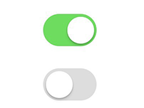
With digital UIs, the action is usually a button, and the state can be displayed nearby. Due to design and space reasons, this has often been simplified into the same element. The first case of this I remember is from early iOS UI:

Can you tell if the switch is on, or if it will go on when the switch is moved over the “on?” Is “on” the state or the action? This always bothered me, and took me a while to learn what it meant. Apple’s continued quest for design simplicity sometimes comes at a cost of usability. Strangely enough Apple fixed this in their design language by removing the text and just going with the color, which is, in my opinion, more understandable.
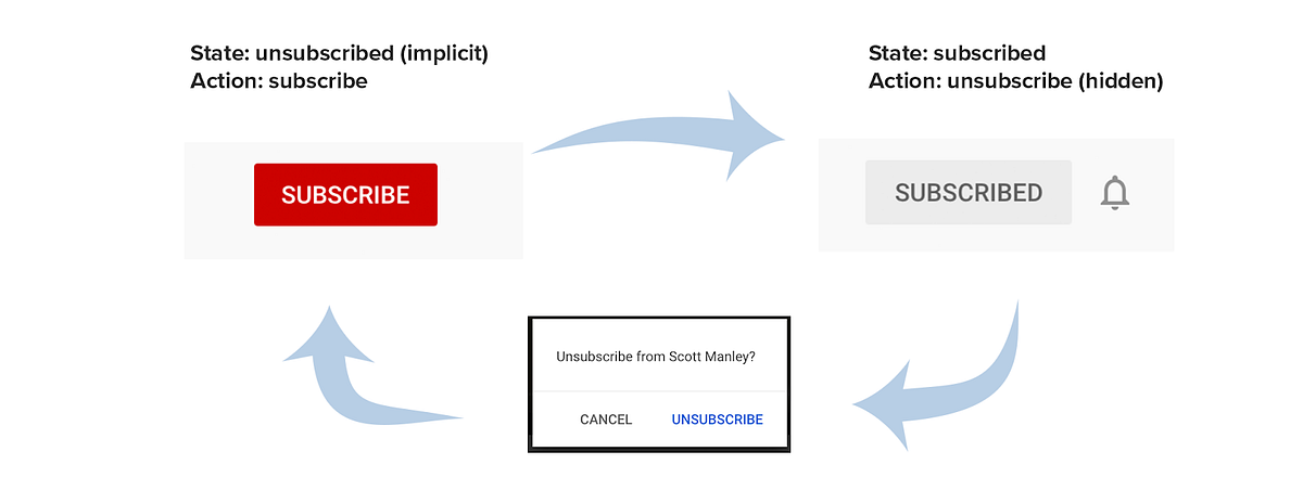
Other common examples of dual state/actions are the “subscribe/subscribed” or “follow/followed” designs. Here are some examples from YouTube and Twitch.
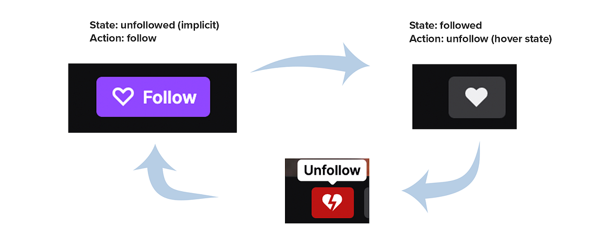
As we start to see more and more of these patterns, we learn how they work and what they mean. Consistency here is key: having elements that show states mixed with actions can be confusing, and must be designed with care. We’re trying to use your products, don’t make us have to think.
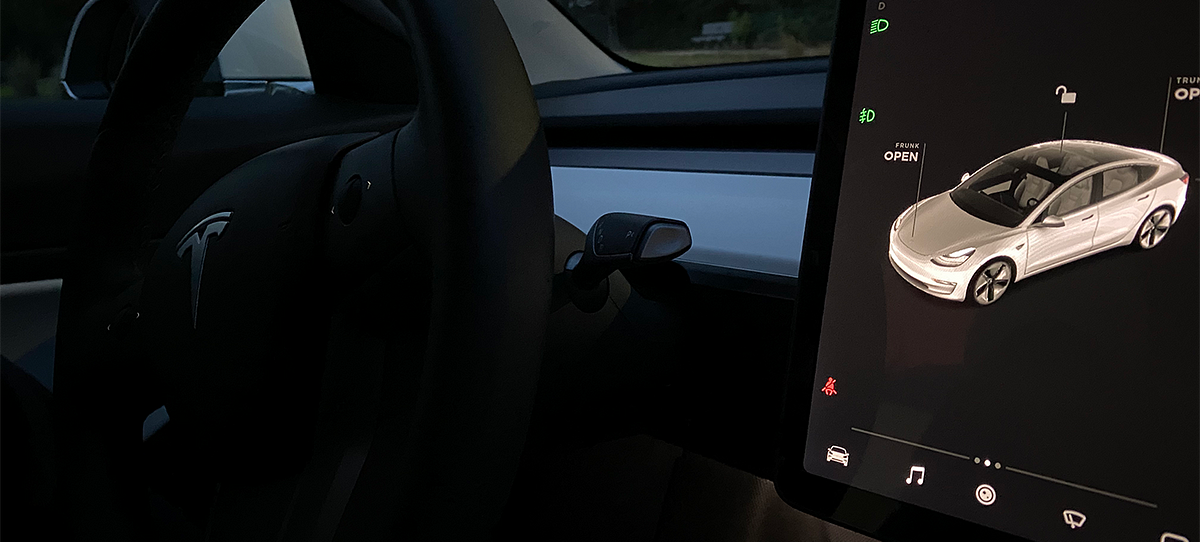
And then there is Tesla. Tesla sometimes has state and action elements, and sometimes they’re just actions. The fact that it’s a car presents a challenge with the word “open.” Unlike follow/followed or subscribe/subscribed, “open” can either be in the verb form to indicate the action, or the adjective form to indicate the current state. Take a look at this screen from Tesla’s new UI:
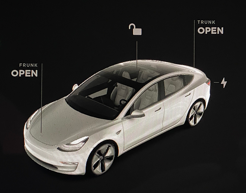
Are the trunk and frunk open, or are those the actions to open them? If those are the actions to open the trunk/frunk, why not make them buttons to imply an action? If those are actions (they are) and not the state, that would logically imply the current state is closed. Yet for the lock icon, it’s reversed: it shows the current state, and clicking on it will lock the car.
The same problem exists in the Tesla mobile app:
This is from the main screen of their mobile app, which is how you control the car. Can you guess what these three buttons are saying about the state and the action they’ll do?
The answer is: the fan is off, the frunk is closed, and the car is locked. Clicking each will in turn: turn on the fan, open the frunk, and unlock the car. Did you expect that?
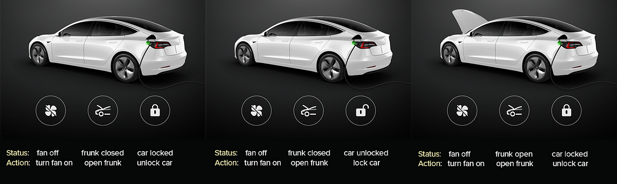
The app switches between showing the state on the button, and state on the car itself depending on if it’s the fan, frunk, or the door lock. Confused yet? When the action and state are on the button, it’s not clear if this is the current state or future state if pressed.
Strangely enough, they have a very clear UX of the same issue on the “controls” menu:
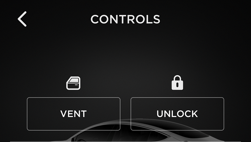
Now the state is shown above the button, and the button’s action is very clear. Why the different UX here?
Conclusion:
Your users are constantly trying to understand and use your products. You should do your best to make the actions predictable and consistent. Eventually your users will learn to use whatever UI/UX you make them use*. Tesla makes beautiful, well-made products, and their UI is wonderful to use - save for these buttons. I imagine they were deciding between clarity and simplicity. I just wish they would make it so I don’t have to think.
*Switching the experience to something more logical may initially confuse and annoy your existing users who have gotten used to it. When testing interfaces like this, this existing user bias is called “primacy effect.” The best way to avoid this is to segment your test to only new users who don’t have an experience bias.