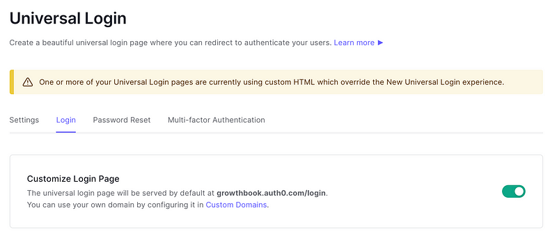
Auth0 is a great way to quickly integrate authentication with your app. We used it at Growth Book when getting started with our MVP. One slightly frustrating thing is that as soon as you enable a custom UI for your login page, the possible templates all look much worse than the non-customized “Universal Login” version.

Auth0 gives you three templates by default. They are all older styles which feel quite clunky, missing password reset, and login with google. It’s clear that this feature isn’t getting much support from Auth0. I spent a little bit of time getting our login page working, and thought I would share the code for others.
We wanted a more integrated experience, and one that matched our onboarding UX. This meant creating a two column, full height, layout with the forms integrated on the right. I included an updated bootstrap css library (the default templates used 3.0) and a custom font from Google. Here is the code:
The code could be improved — the switching between login/register/forgot isn’t great, and it should use more ES6 styles. Hope this helps.


