
The case for looking beyond the Average Treatment Effect
One number, many stories
You moved a recommendations carousel higher on the product page. After two weeks, the experiment comes back: +1.6% on conversion rate. Stakeholders are happy. You ship. You celebrate. You move on.
That workflow is fine. The Average Treatment Effect (ATE) is the right first thing to look at. It's what experiments in GrowthBook are typically designed to estimate. If you're going to act on a single number, that's probably the one. But if you stop there, you are leaving money on the table.
What is the Average Treatment Effect (ATE)?
The ATE is the difference in average outcome between users in the treatment group and users in control. It's the standard summary statistic from a randomized experiment — and the right first number to look at. But it summarises across every individual response in your experiment sample.
That 1.6% is an average. Your user base contains many different types of people: different usage patterns, different needs, different baseline behaviours. You already know this. You probably segment users for marketing and personalisation already, or you wish you did. Yet when the experiment result comes back, all of that diversity collapses into a single number.
The question is: what is that single number hiding? In this post, we look at what the average treatment effect actually represents, why the same average can mask very different realities, and what that means for how you act on your results.
What the Average Treatment Effect (ATE) really means
The average treatment effect is exactly that — an average. Behind it sits a distribution of individual responses: some users who gained a lot, some who barely noticed, some who were actively put off by the change. It is a summary across your entire experiment sample, not necessarily the effect on any particular user. If your metric is binary — the user converts or they don't — nobody converted 1.6% more times. Some users were pushed over the edge and converted when they otherwise wouldn't have. Others were unaffected. Some may have been put off by the change and thus did not convert. What you observe as +1.6% is the net result after all of these individual responses are averaged together.
You cannot observe any individual user's treatment effect — that's the fundamental problem of causal inference. You only ever see what actually happened to a user, never what would have happened without the treatment. But the underlying distribution of those individual effects is real. The average effect tells you where the centre is, but it tells you nothing about the rest.
Why the same experiment result can hide very different realities
To see why this matters, consider three scenarios — all with the same average effect of +1.6%. The distributions below are conceptual illustrations of what might be hiding behind that average. But the question of which one you're in is very real.
Scenario (a): Nearly everyone benefits a little
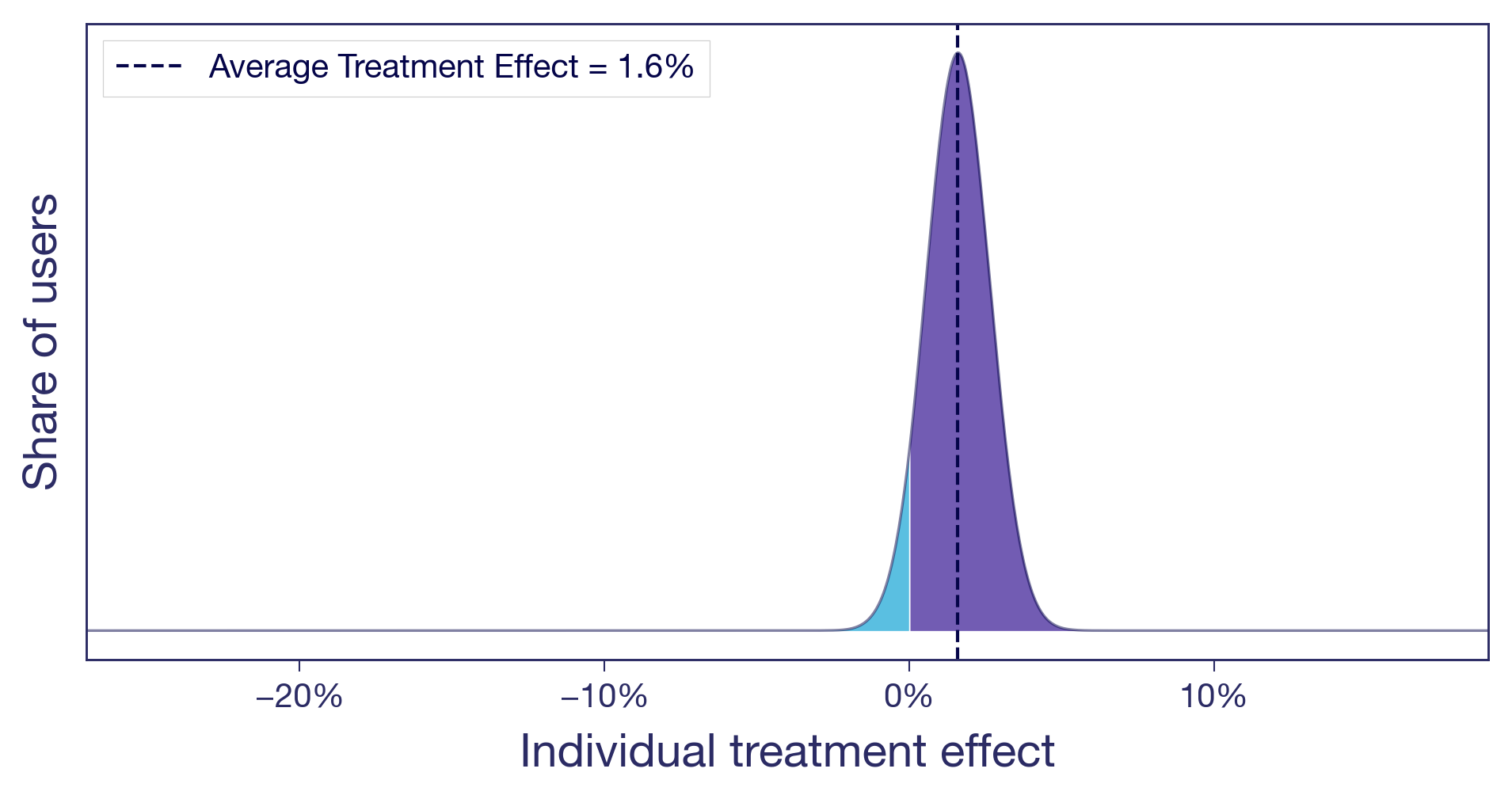
Think of a pure copy change: rewording a headline on a product page. There's no structural change, no new functionality. The tweak lands roughly the same way for everyone (not all copy changes do of course, but this one did). A small, diffuse lift. This is what most people implicitly picture when they hear "1.6% lift." It's also the easy case. When the effect is similar for most users, the average tells the whole story and you can act on it with confidence.
Scenario (b): One subgroup drives the entire effect
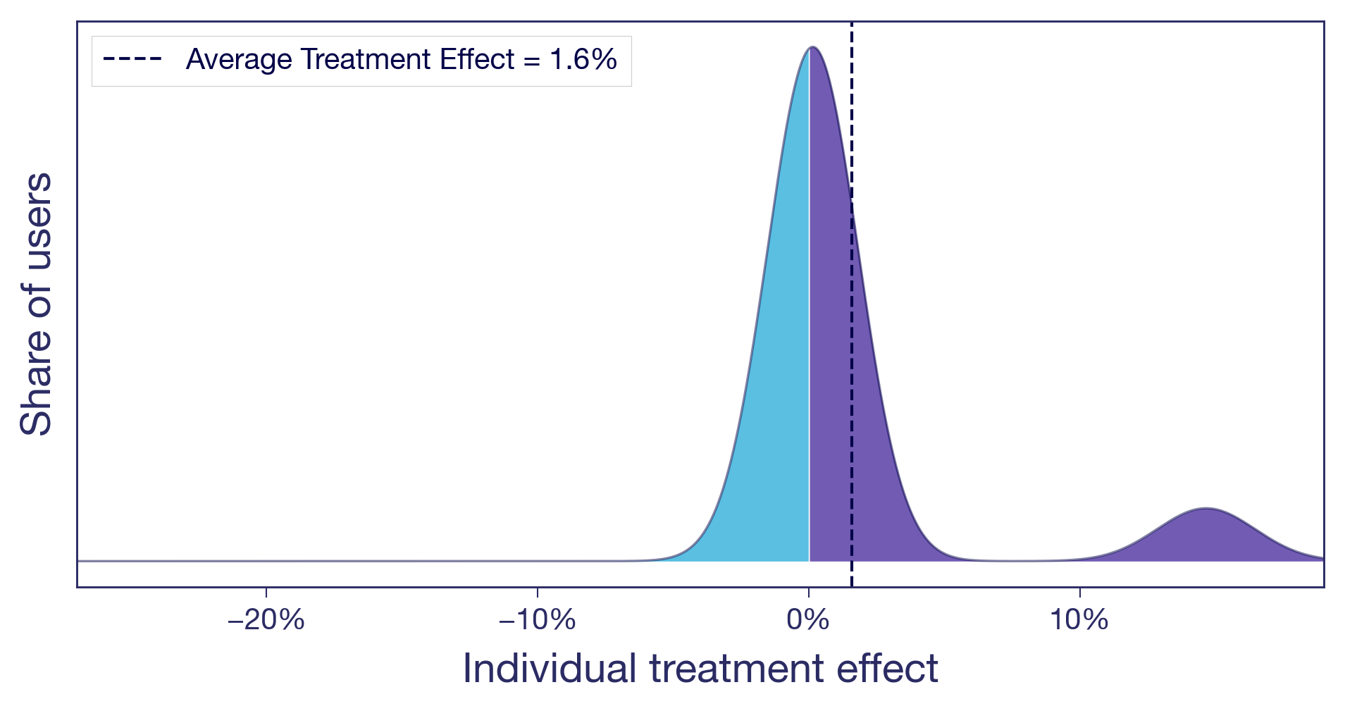
Let's take the carousel for another spin. You moved it higher on the product page. Two types of users now have very different experiences. Browsers, the ones who enjoy discovering new products, engage with the carousel and convert more. Searchers, users who came for a specific item, now have to scroll past content they never asked for. Slightly annoying. The browsers see a meaningful positive effect. The searchers see zero or slightly negative. Most users barely notice. The +1.6% average is real, but it's driven by a single user type, and you are shipping the change to everyone.
Scenario (c): Winners and losers
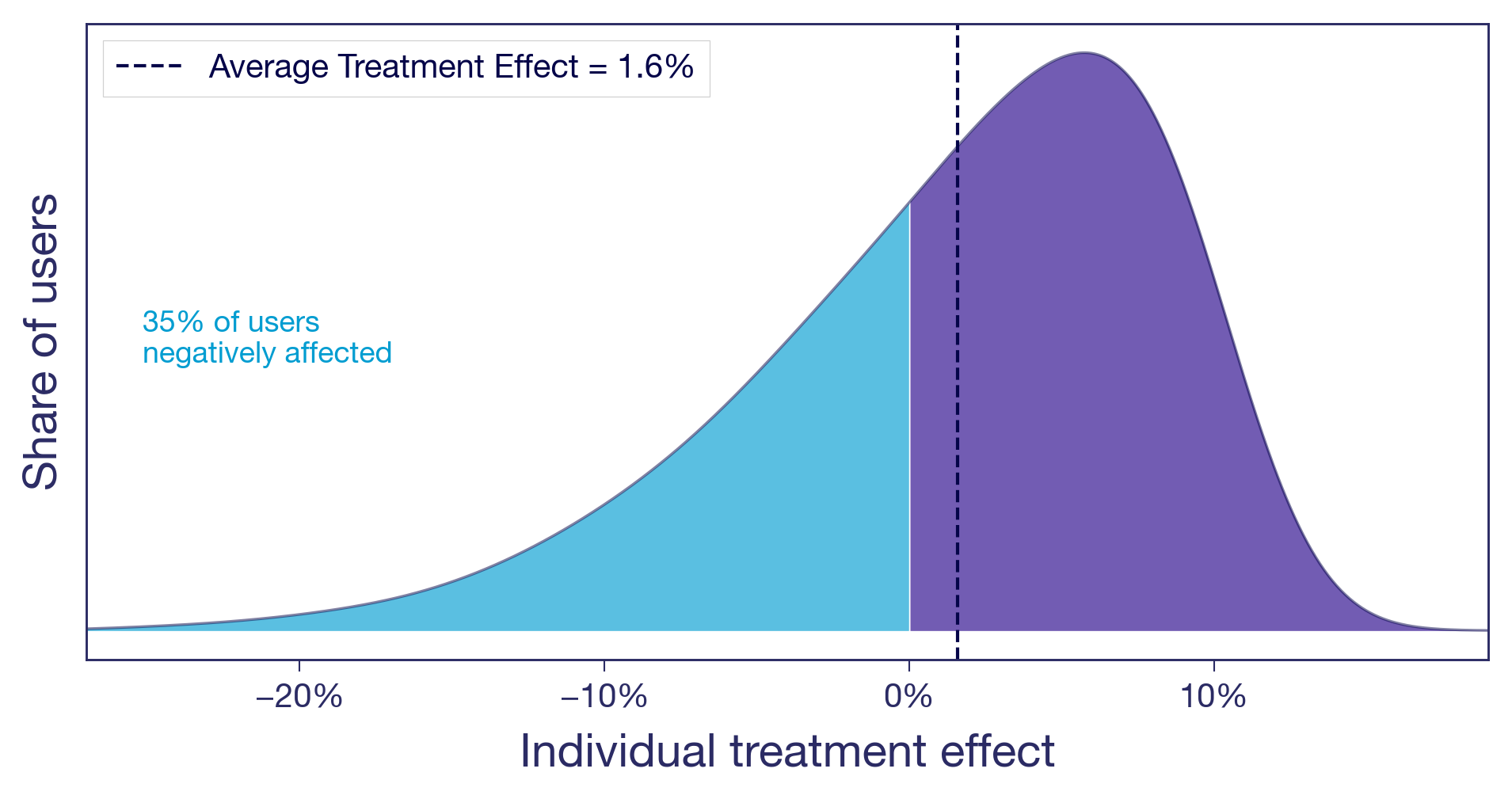
You raised the free shipping threshold from $25 to $50. Users who were comfortable buying one or two small items with free shipping now face a delivery charge that feels offensive. Some abandon their carts. Some find the same items with a competitor. Meanwhile, users with larger baskets add a few extra items to clear the new threshold, pushing average order value up. The overall effect is positive, but a sizeable share of users are notably worse off.
The bottom line: from the average effect alone, you cannot tell which of these scenarios you are in. The decision to ship looks the same in all three cases. The implications are very different.¹
Why experiment results vary across user segments — and why it matters
This isn't an academic exercise. Which scenario you are in changes what you should do next.
Is the signal real? An effect driven entirely by one segment is either a discovery or a warning sign. If the subgroup is large and the effect is real, you may have found something worth doubling down on. If the group is small and their effect noisy, your positive result may not replicate.
Why, not just what. Understanding who benefits also generates hypotheses about why the treatment works. That's how you build on experiment results rather than just collecting them. A team that knows the carousel helped browsers but irritated searchers can design a better version: show it on category pages, suppress it on search results. A team that only sees +1.6% moves on to the next test.
Will it last? Your experiment ran at a specific point in time, on the users who happened to be active during that window. If the effect is similar for all your users, it is more likely to hold as your user base evolves. If it's concentrated in one segment, the result is only as durable as that segment's share of your traffic. If the lift came from a seasonal cohort of holiday shoppers, it may not survive into Q1. What will your user base look like next quarter, or next year? An effect that's similar across users and one that's concentrated in one particular segment age very differently.
From average results to individual insights in experimentation
You don't have to use fancy machine-learning frameworks to start asking these questions. The simplest version is to look at your experiment results across dimensions you already have: geography, platform, user tenure, purchase frequency. In GrowthBook, that's what dimension splits are for. From a different angle, quantile treatment effects let you compare different percentiles of the outcome distribution across variants — for example, did the free shipping change hurt users at the low end of spend while benefiting those at the top? And with Experiment Dashboards, you can make these breakdowns a default part of every experiment readout, so looking beyond the average becomes standard procedure.
For teams willing to go further, more advanced methods can produce effect estimates at the individual level — the closest you'll get to making those conceptual distributions real.
And once you know the effect varies by segment, you don't have to ship the same experience to everyone. Most experimentation platforms, GrowthBook included, let you target features to specific user segments. The experiment told you who benefits. Targeting lets you act on it.
Slicing data post-hoc does come with real statistical risks, but there are well-established ways to handle them. The next post in this series covers how to navigate these waters: how to slice your experiment data, what to watch out for, and how to tell a real finding from a lucky split.
In the meantime, explore dimension splits and think about what dimensions might be interesting in your experiments. And next time you're building a feature, think about how your different users might respond to it, and who might not like it at all.
As always, beware and have fun!
This is part of a series on treatment effect heterogeneity. Next post is about how to uncover the different ways users respond to the same treatment, without fooling yourself.
¹ This idea is developed more formally by Gelman, Hullman, and Kennedy (2024) as "causal quartets" — different data-generating processes that produce identical average effects. The American Statistician, 78(3), 267–272.